Hallwerk
UI/UX & Product Design
Three years of fast, unsystemized growth had left an expense-management product with three different button styles — and engineering slowing down because every new screen needed a fresh design decision.
The problem
Hallwerk is a fictional expense-management SaaS product used by mid-size DACH finance teams. Three years of fast growth had left the product with inconsistent spacing, three different button styles, and no documented pattern library. Every new screen required a fresh design decision instead of reusing an established one — which meant engineering was slowing down on a problem that had nothing to do with the difficulty of the features themselves.
Discipline demonstrated
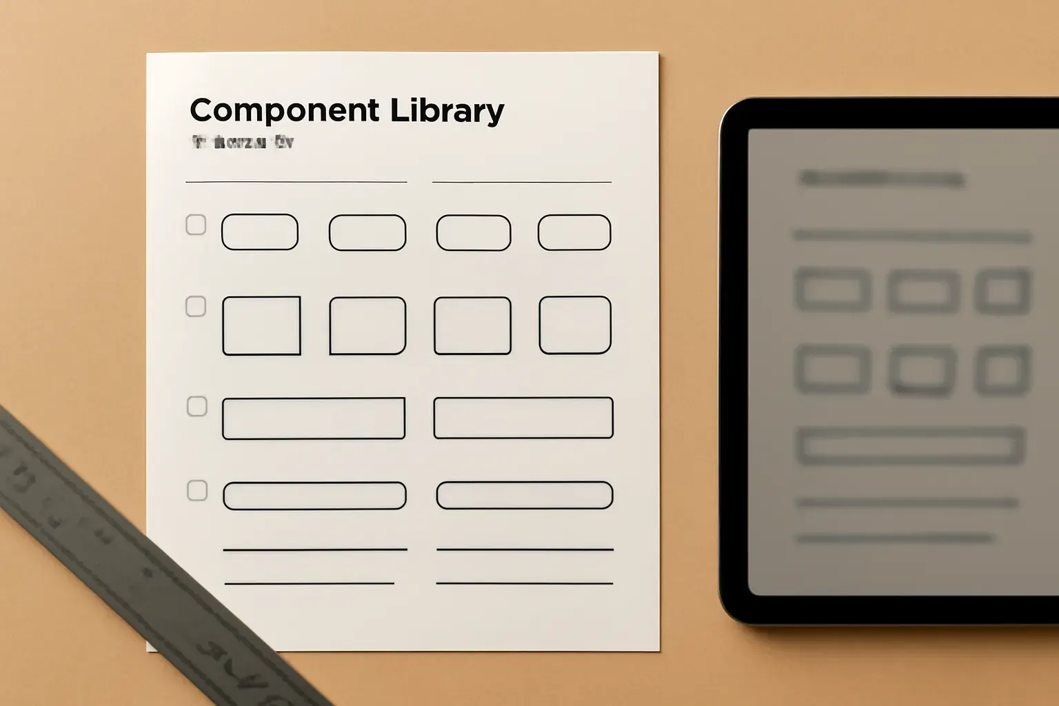
Specimen panels: a component-library specimen sheet and a before/after spacing diagram standing in for additional photography.
01
UX audit methodology.
A systematic pass through the product's core flows, cataloguing every inconsistency with a specific screen and reasoning, not a vague "this feels off."
Specimen panels: a component-library specimen sheet and a before/after spacing diagram standing in for additional photography.
02
A documented component system.
Buttons, inputs, cards and states resolved into a single, named library — the same specimen-sheet discipline used across every UI/UX engagement.
Specimen panels: a component-library specimen sheet and a before/after spacing diagram standing in for additional photography.
03
Handoff built for an in-house team.
Documentation written so Hallwerk's own engineers could extend the system correctly without the studio in the room for every new screen.